The challenge.
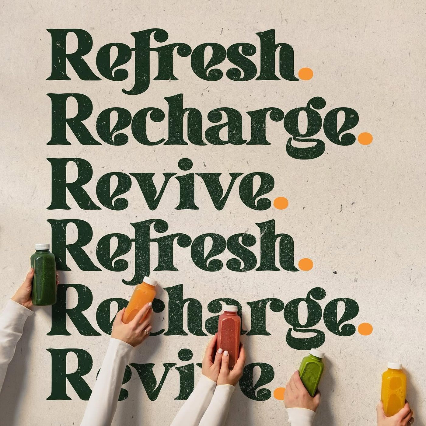
A juice, coffee and tea bar starting from nothing. No name treatment, no look, no voice. It had to feel fresh and healthy without landing in the same pale green minimal corner as every other juice brand, and it had to work small, on a bottle label and a cup, as well as large on a wall.
What we did.
Built the identity from conception. Drew the wordmark around a single orange drop so the mark reads at any size and still works stripped back to the drop alone. Set the palette as deep green and orange on kraft so the packaging feels like paper, not plastic. Wrote the line, Refresh. Recharge. Revive., and built a type system around it that carries the brand across the wall, the bottles, the cups and the apparel.
The result.
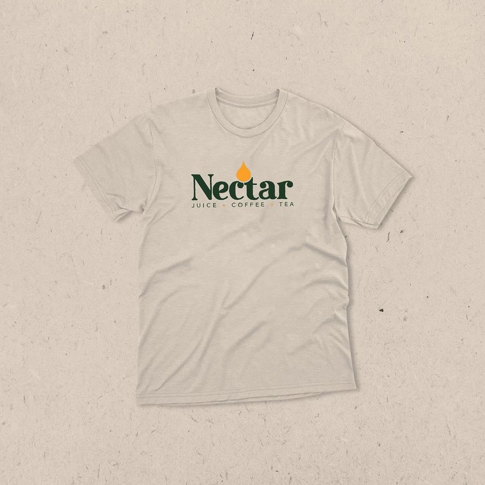
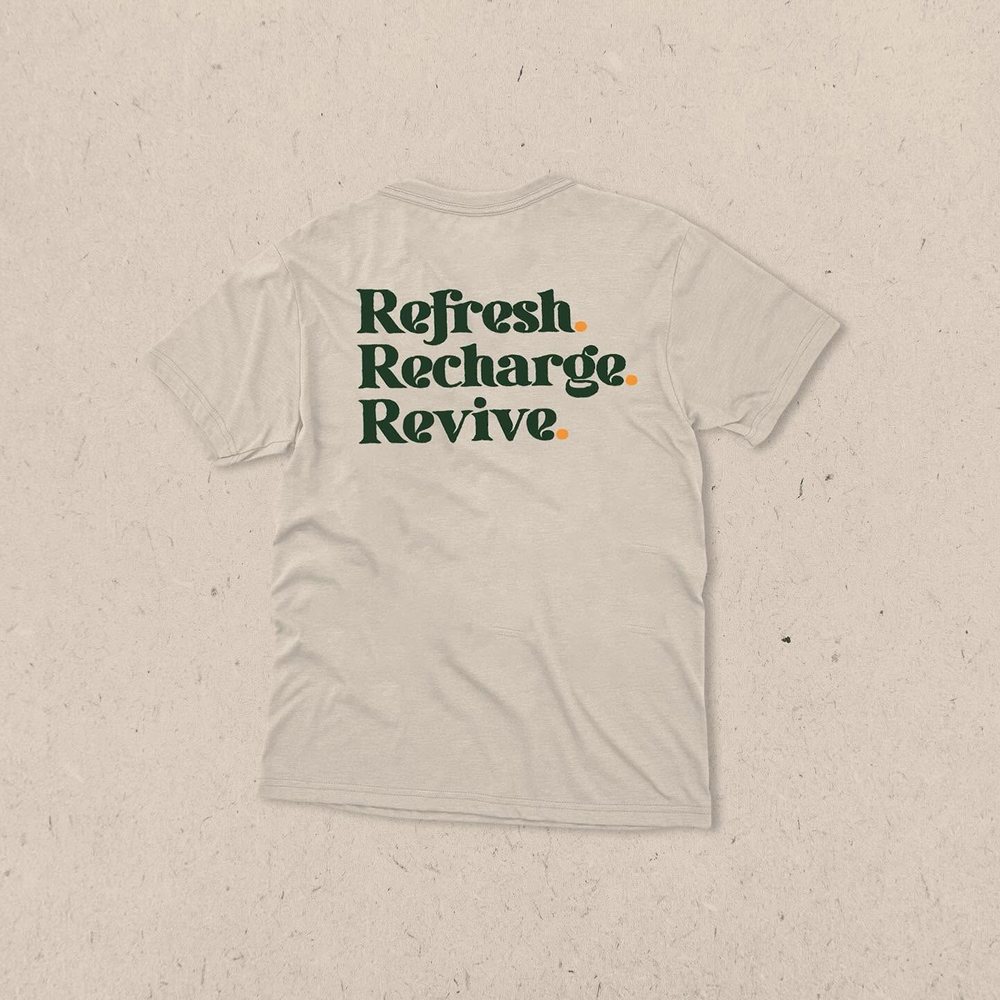
One system that runs from a bottle label to a wall to a tee, with the drop working as a standalone mark on anything too small for the full logo.