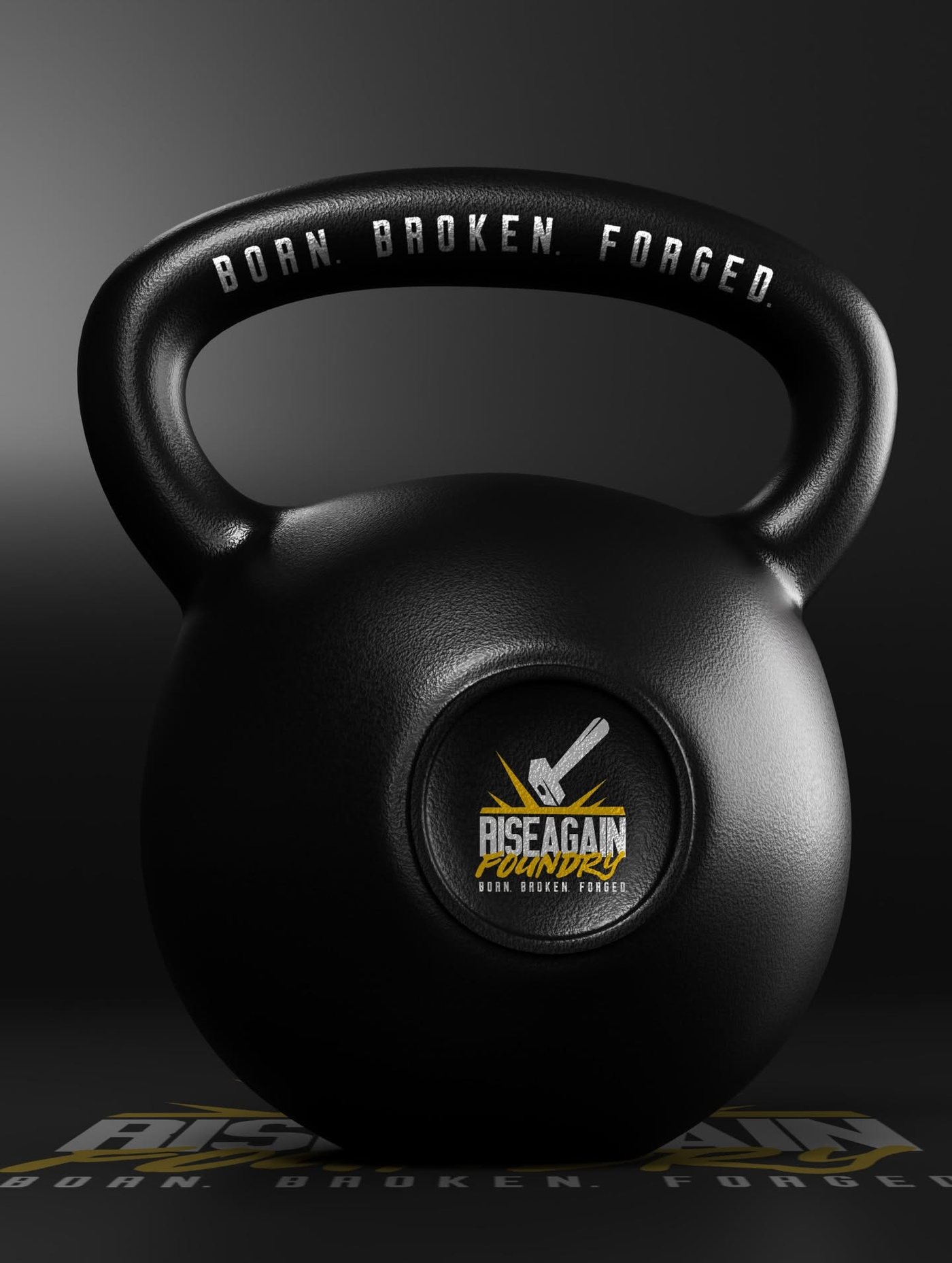
The challenge.
A strength brand needed a mark with weight to it. The hard part is that this category is crowded with the same hammers, anvils and distressed type, and the mark had to survive being cast into iron, cut as a sticker and printed small on a chest, which kills most detailed logos.
What we did.
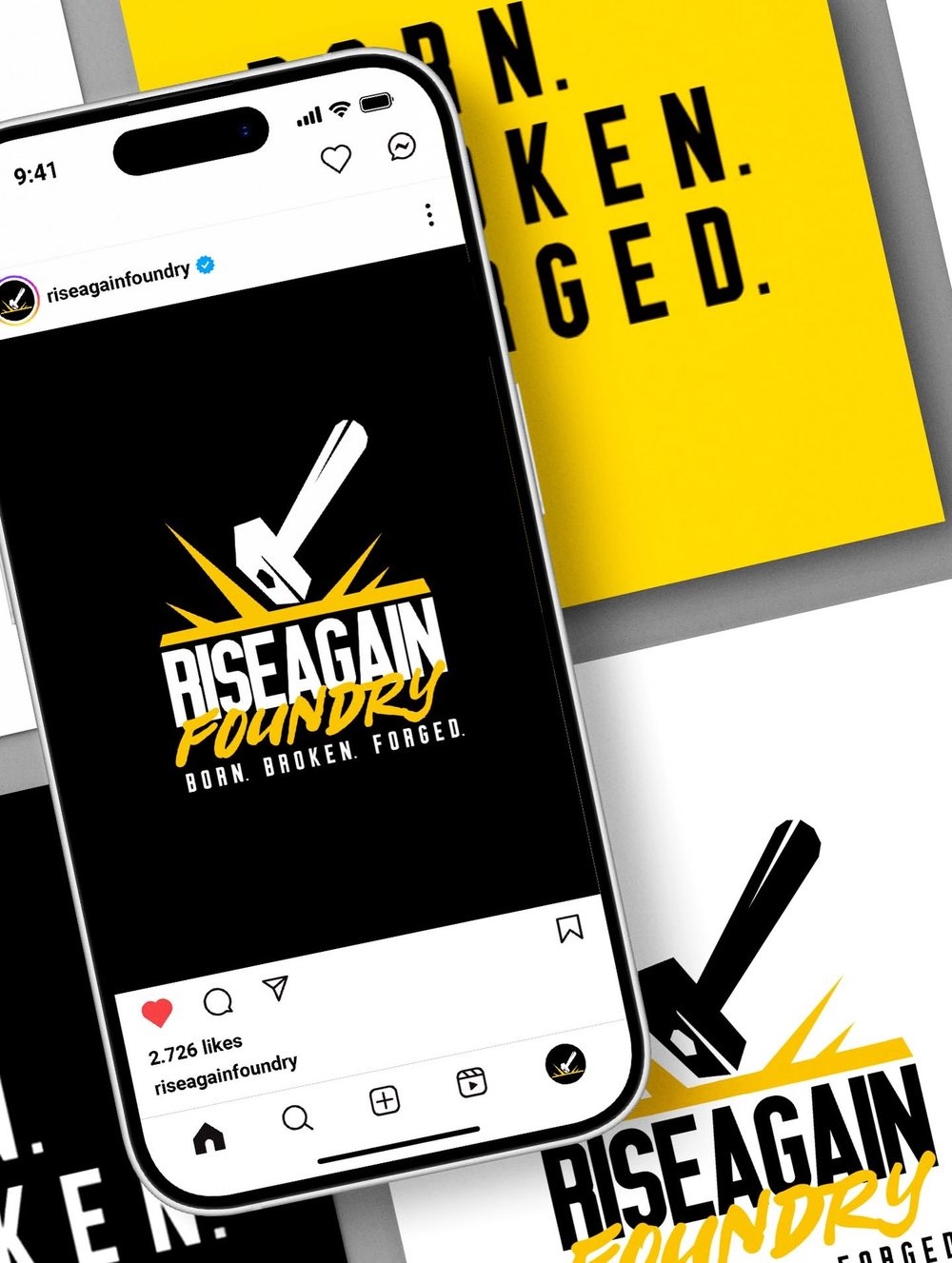
Built the identity from conception around the hammer strike itself rather than the hammer alone, so the energy is in the sparks and the mark still reads when it is one colour and an inch wide. Paired condensed block caps with a brush script for the word Foundry, and locked the line Born. Broken. Forged. to the mark as a permanent part of the system. Applied it to product, apparel, stickers and a black and yellow social system.
The result.
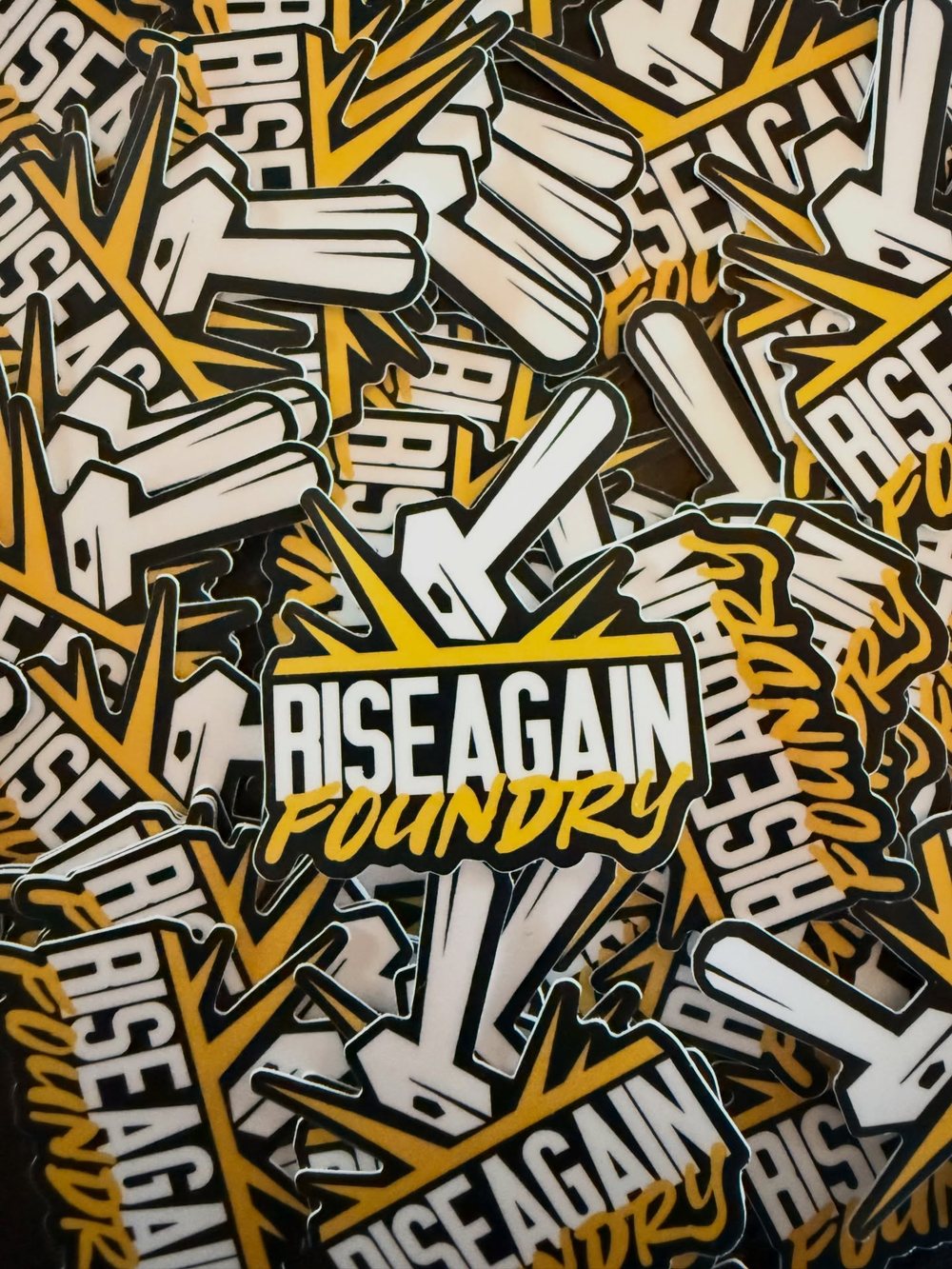
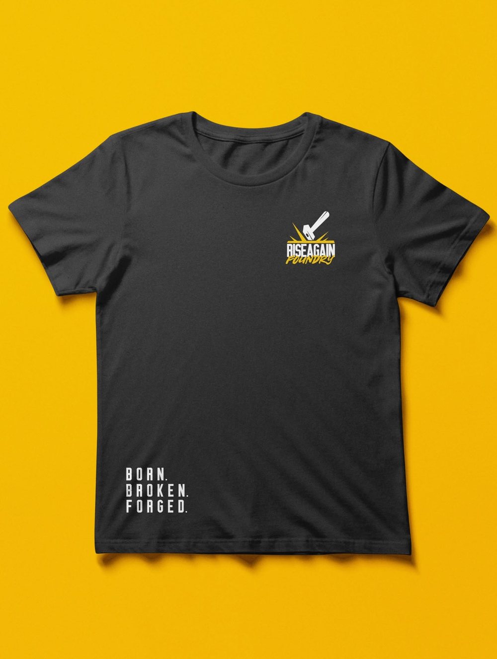
One mark that works cast into a kettlebell, die cut as a sticker, embroidered on a chest and blown up on a feed.